
In today's fast-paced B2B landscape, raw sales data is overwhelming. It's a stream of numbers, deals, and activities that can easily obscure the bigger picture. The difference between a good sales team and a great one often lies in how they interpret and act on this information. This is where a well-designed sales dashboard becomes a game-changer. It's not just a reporting tool; it's a strategic command center that transforms complex data into clear, actionable insights.
A powerful dashboard helps sales leaders forecast with accuracy, motivate their teams with real-time progress, and diagnose pipeline issues before they derail quarterly goals. For a broader understanding of how visual data can drive impactful decisions, explore various business intelligence dashboard examples. They provide excellent context for the focused sales applications we're about to cover.
This guide moves beyond generic templates to provide a deep dive into 7 powerful sales dashboard examples from platforms like Scoro, Pipedrive, and HubSpot. We'll dissect what makes each one effective, analyze its strategic focus, and provide replicable tactics you can use to build a dashboard that drives revenue and empowers your team to close more deals, faster.
1. Scoro
Scoro positions itself as an end-to-end work management solution, and its sales dashboard functionality is a core component of this comprehensive approach. Unlike platforms that focus solely on pipeline visualization, Scoro provides a holistic view by integrating project management, billing, and reporting directly into the sales workflow. This makes it a powerful choice for businesses, particularly service-based companies, that need to see how sales performance impacts resource allocation and overall profitability in real time.
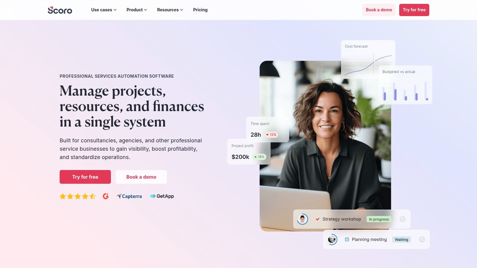
The platform's strength lies in its highly customizable dashboards. Users can build tailored views that track not only standard sales KPIs but also connect them to project margins, billable hours, and team utilization. This creates a single source of truth that aligns sales, finance, and operations.
Strategic Analysis & Actionable Takeaways
Scoro's dashboard design excels at providing a top-down overview for leadership while offering granular data for sales reps. The main dashboard often features key performance indicators like Booked Sales vs. Goal, a visual Sales Pipeline with weighted values, and Team Activity Overviews.
Strategic Insight: Scoro’s key advantage is its ability to directly link sales activities to financial outcomes within a single interface. By tracking metrics like "Invoiced vs. Quoted," a sales manager can immediately identify discrepancies and address issues in the sales-to-billing process, improving cash flow and forecast accuracy.
Actionable takeaways for your own dashboard:
- Integrate Financial Metrics: Don't just track deal stages. Include widgets for quoted value, invoiced amounts, and profit margins to create a full-cycle view of revenue generation.
- Monitor Activity Efficiency: Use activity tracking (calls, meetings, tasks) alongside conversion rates. This helps identify which specific lead generation activities are driving the most results, a crucial step for optimizing outreach. This is especially vital when exploring new markets, such as when growing your lead generation efforts in Ireland.
- Customize Views by Role: Create a high-level "Executive" dashboard focused on revenue goals and forecasts, and a separate "Sales Rep" dashboard centered on individual pipelines, upcoming activities, and commission tracking.
Platform Details
- Best For: B2B service companies, agencies, and consultancies needing an all-in-one platform to manage sales, projects, and financials.
- Pricing: Pricing is not publicly listed and requires contacting their sales team for a custom quote. This suggests a focus on tailored enterprise solutions.
- Pros: Extremely comprehensive feature set, highly customizable dashboards, and strong integration capabilities.
- Cons: The extensive functionality can present a steep learning curve for new users, and the lack of transparent pricing may be a barrier for smaller businesses.
Website:https://www.scoro.com/sales-dashboard/
2. Pipedrive
Pipedrive is built around a single, powerful philosophy: sales is a sequence of actions that can be managed and optimized. Its sales dashboard is a direct reflection of this, focusing intently on visual pipeline management and activity tracking. Designed by and for salespeople, the platform strips away unnecessary complexity to provide a clear, intuitive interface that helps teams see exactly where every deal stands and what action needs to happen next.
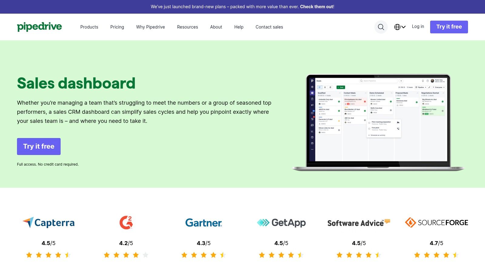
Unlike all-in-one solutions, Pipedrive's core strength is its laser focus on the sales pipeline. The user-friendly, drag-and-drop interface makes it incredibly simple for reps to update deal progress. This emphasis on ease of use encourages high adoption rates, ensuring the data in the dashboard is always current and reliable, making it a favorite for teams prioritizing straightforward pipeline management.
Strategic Analysis & Actionable Takeaways
Pipedrive’s dashboard design is geared towards momentum and clarity. Key widgets typically display the number of Deals Started, Deals Won, and a visual Sales Funnel showing conversion rates between stages. The platform's standout feature is its activity-based selling prompt, which pushes reps to schedule a "next activity" for every deal, directly impacting pipeline velocity.
Strategic Insight: The key to Pipedrive's effectiveness is its direct correlation between sales activities and results. By visualizing metrics like "Activities Completed" next to "Deals Won," a manager can quickly diagnose whether a slump in performance is due to a lack of effort (low activity) or a lack of effectiveness (low conversion). This is invaluable when building a startup sales team and establishing a repeatable process.
Actionable takeaways for your own dashboard:
- Prioritize Activity Metrics: Your dashboard should prominently feature activity goals and completion rates (e.g., calls made, emails sent, demos scheduled). This keeps the team focused on the inputs that drive outputs.
- Visualize the Funnel: Don't just list deals. Use a funnel chart to highlight conversion rates between each stage. This immediately shows where deals are stalling, allowing for targeted coaching and process improvements.
- Track "Rotting" Deals: Pipedrive excels at flagging deals that have been inactive for too long. Implement a "Deal Rotting" widget in your own dashboard that shows deals with no recent activity, prompting reps to re-engage or disqualify them.
Platform Details
- Best For: Small to medium-sized businesses (SMBs) and startups that need an intuitive, sales-focused CRM with a strong emphasis on pipeline visualization and activity management.
- Pricing: Pipedrive offers several transparent pricing tiers, starting from around €14.90 per user/month, making it highly accessible for teams of all sizes.
- Pros: Extremely user-friendly with a minimal learning curve, excellent visual pipeline management, and affordable, transparent pricing.
- Cons: Reporting and customization options are less advanced than enterprise-level CRMs, and some key features are locked behind higher-priced plans.
Website:https://www.pipedrive.com/en/features/sales-dashboard
3. Databox
Databox stands out by positioning itself not just as a dashboard tool, but as a central data hub accessible to everyone on the team, regardless of technical skill. Its core strength is the seamless integration with over 100 data sources, allowing users to pull information from their CRM, marketing automation platforms, and advertising accounts into one unified view. This makes it one of the most versatile sales dashboard examples for businesses that rely on a diverse tech stack.
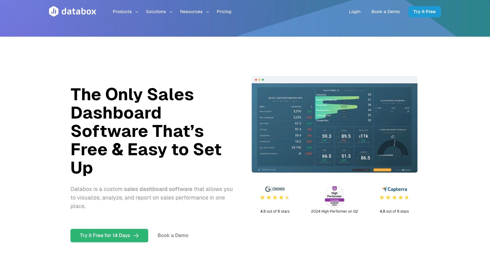
The platform champions ease of use with a drag-and-drop interface and a vast library of pre-built templates. This approach significantly lowers the barrier to entry, enabling sales managers to create and deploy sophisticated, real-time dashboards in minutes without needing support from a data analyst or developer.
Strategic Analysis & Actionable Takeaways
Databox dashboards are designed for immediate clarity and action. They typically visualize performance against goals, showing progress with clear color-coding (green for on-track, red for behind). Key visualizations include Deals Won vs. Goal, Sales Activity Leaderboards, and Pipeline by Stage.
Strategic Insight: Databox’s primary advantage is its ability to democratize data. By connecting disparate tools like HubSpot, Google Analytics, and Salesforce, a manager can create a holistic dashboard that shows how marketing-qualified leads (MQLs) are converting into sales-qualified leads (SQLs) and eventually closed deals, all in one place. This breaks down data silos between marketing and sales.
Actionable takeaways for your own dashboard:
- Combine Marketing and Sales Data: Pull in metrics like website sessions, MQLs, and ad spend alongside your sales pipeline data. This helps you calculate a true lead-to-close conversion rate and cost per acquisition.
- Use Goal-Oriented Visuals: Don't just show numbers; visualize them against a target. Using gauges and progress bars for KPIs like "Revenue vs. Quota" keeps the team motivated and focused on the objective. A crucial aspect of tracking sales performance is making goals visible.
- Leverage Pre-built Templates: Start with a template for your specific CRM (e.g., "HubSpot Sales Pipeline") and then customize it. This saves time and ensures you are tracking industry-standard metrics from the beginning.
Platform Details
- Best For: Small to mid-sized businesses (SMBs) and agencies that need a user-friendly, quick-to-implement solution for combining data from multiple sources.
- Pricing: Offers a free-forever plan with limited features. Paid plans start at around $72 per month (billed annually) and scale based on the number of data connections and dashboards needed.
- Pros: Extremely easy to set up with pre-built templates, extensive list of integrations, and a user-friendly interface perfect for non-technical users.
- Cons: Advanced customization can be less flexible than more complex BI tools, and costs can increase as more data sources are added.
Website:https://databox.com/dashboard-software/sales
4. Smartsheet
Smartsheet takes a unique approach by positioning its sales dashboards within a powerful, spreadsheet-centric work management platform. Rather than being a rigid, dedicated sales CRM, it offers immense flexibility, allowing teams to build and customize sales tracking systems from the ground up using familiar sheet, report, and dashboard functionalities. This makes it an excellent choice for organizations that need to integrate sales data directly with project management, resource planning, and other operational workflows.
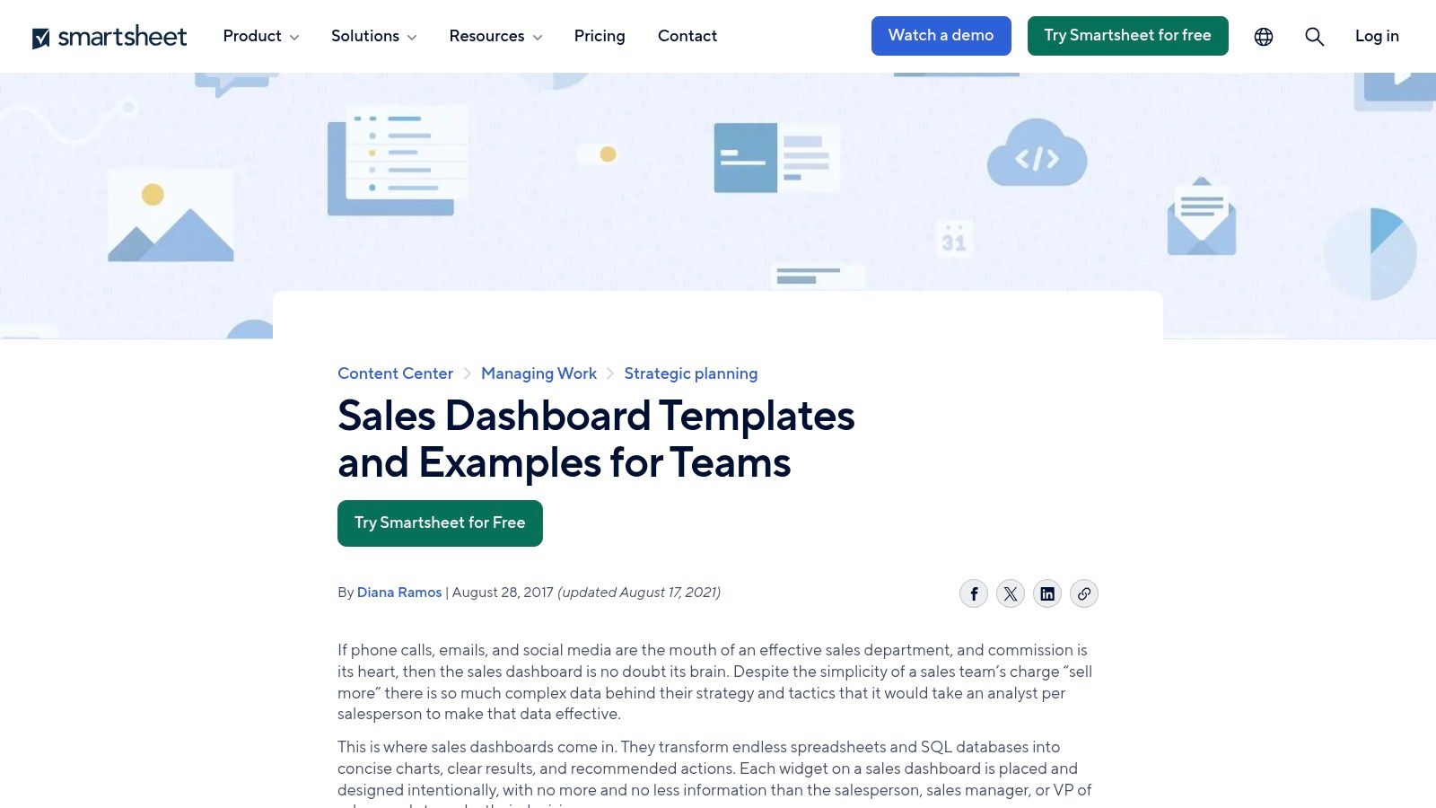
The platform's core strength is its adaptability. Using pre-built templates as a starting point, teams can quickly stand up a sales pipeline, account management tracker, or a sales activity log. These underlying sheets then feed data into highly visual and interactive dashboards, which can be shared with stakeholders across the company, ensuring everyone is aligned on key performance metrics.
Strategic Analysis & Actionable Takeaways
Smartsheet’s dashboards are designed for clarity and collaborative action. They typically visualize data from underlying sheets, showcasing metrics like Pipeline by Stage, Quarterly Sales vs. Goal, and Win/Loss Analysis. The platform excels at creating centralized hubs where sales data lives alongside project timelines and task assignments.
Strategic Insight: The key advantage of Smartsheet is its ability to create a single source of truth that is both powerful and accessible to non-technical users. A sales manager can build a dashboard that not only tracks deal flow but also links each deal to a corresponding project plan, resource assignments, and onboarding checklists, all within the same ecosystem.
Actionable takeaways for your own dashboard:
- Combine Pipeline Data with Action Items: Don't just show deal stages. Use Smartsheet’s collaborative features to link tasks and owners directly to deals in the pipeline, making it clear who is responsible for the next step.
- Use Conditional Formatting for At-Risk Deals: Implement rules in your source sheet to automatically highlight deals that are stalled or have passed their expected close date. This visual cue on your dashboard immediately draws attention to problem areas.
- Build Role-Specific Reports from a Master Sheet: Maintain a comprehensive master sales data sheet and use Smartsheet's reporting feature to create tailored dashboard widgets for executives (high-level revenue), managers (team performance), and reps (individual pipeline).
Platform Details
- Best For: Teams looking for a flexible, collaborative platform to manage sales processes alongside other business projects, especially those comfortable with a spreadsheet-like interface.
- Pricing: Smartsheet offers several tiers, starting with a Pro plan at $7 per user/month (billed annually) and a Business plan at $25 per user/month, with Enterprise options available.
- Pros: Highly flexible and customizable, strong collaboration and workflow automation features, and a user-friendly interface that is easy to adopt.
- Cons: It lacks some of the deep, specialized sales analytics found in dedicated CRM tools, and costs can increase as more users and advanced features are added.
Website:https://www.smartsheet.com/sales-dashboard-examples-and-templates
5. Geckoboard
Geckoboard specializes in one thing: creating clear, real-time, and highly visible dashboards. Rather than being an all-in-one CRM or project management tool, it is a dedicated platform designed to pull data from various sources and present it in an easily digestible format. Its primary goal is to make key metrics accessible to the entire team, often displayed on large screens or TVs in an office setting to foster a data-driven culture and keep everyone aligned on performance goals.
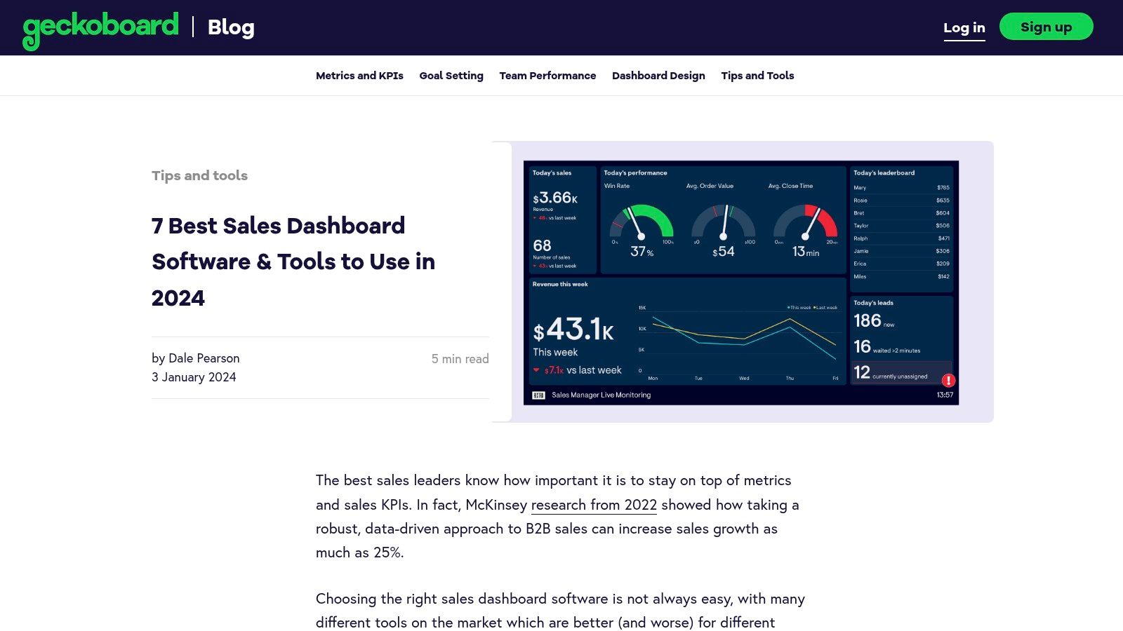
The platform’s core strength is its simplicity and speed of implementation. With over 90 pre-built integrations for tools like Salesforce, HubSpot, and Google Analytics, users can connect their data sources and build a functional sales dashboard in minutes using a drag-and-drop interface. This makes it an excellent choice for teams that need immediate visibility without a complex setup process.
Strategic Analysis & Actionable Takeaways
Geckoboard’s approach is centered on motivation and transparency. The dashboards are designed to be at-a-glance references, featuring leaderboards, progress towards targets, and real-time activity feeds. Key metrics often displayed include Deals Won This Month, New Leads by Source, and an Individual Rep Leaderboard to encourage friendly competition and celebrate wins publicly.
Strategic Insight: Geckoboard excels at transforming data into a motivational tool. By displaying a live leaderboard or a "Deals Closed Today" counter on a shared screen, it gamifies performance and creates a powerful, immediate feedback loop that keeps the entire sales floor engaged and focused on hitting collective targets.
Actionable takeaways for your own dashboard:
- Focus on Motivational Metrics: Include widgets that highlight wins and progress, such as a "Win of the Day" or a leaderboard ranking reps by revenue closed. This transforms the dashboard from a simple reporting tool into a source of team morale.
- Prioritize Real-Time Data: Use integrations that provide live updates. Seeing a deal's status change to "Won" in real time is far more impactful than reviewing a static report at the end of the day or week.
- Keep it Visually Simple: One of the best sales dashboard examples is one that can be understood in seconds. Use large numbers, clear charts, and color-coding (e.g., green for on-target, red for behind) to make the information scannable from a distance.
Platform Details
- Best For: Sales teams of all sizes looking for a simple, highly visible way to track real-time KPIs and foster a transparent, data-driven culture.
- Pricing: Plans start at $49/month for the Starter plan, with more advanced plans offering more dashboards and users. A 14-day free trial is available.
- Pros: Extremely user-friendly with a fast setup, wide range of integrations, and an excellent focus on team visibility and motivation.
- Cons: Lacks the deep, granular analytics and forecasting capabilities of more comprehensive BI or CRM platforms; it is a visualization tool first and foremost.
Website:https://www.geckoboard.com/blog/7-best-sales-dashboard-tools-software-2024/
6. HubSpot
HubSpot is a dominant force in the inbound marketing and sales software space, and its reporting and dashboard functionality serves as the central nervous system for its entire ecosystem. Rather than being a standalone analytics tool, HubSpot’s dashboards are deeply integrated with its CRM, Marketing Hub, Sales Hub, and Service Hub. This creates a seamless flow of data, allowing businesses to track the entire customer journey from the first marketing touchpoint to the final sale and beyond. This makes it an incredibly powerful option for companies already invested in the HubSpot platform.
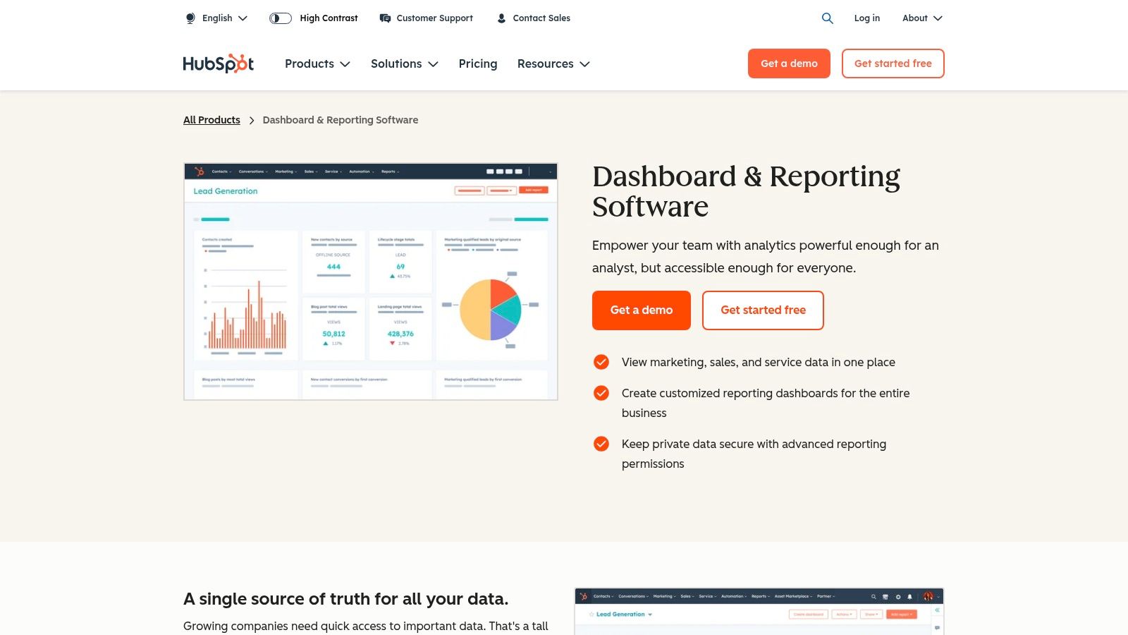
The platform excels in user-friendliness, offering a drag-and-drop editor and a library of pre-built dashboard templates that make it easy to get started. Users can create and customize reports for sales activities, pipeline forecasting, and team performance without needing a dedicated data analyst. This accessibility empowers sales teams to take ownership of their data and performance monitoring.
Strategic Analysis & Actionable Takeaways
HubSpot’s dashboards are designed to provide clear, immediate insights into sales performance. Common widgets include Deal Forecast, Sales Performance (closed-won vs. goal), and Team Activity totals. These out-of-the-box reports are perfect for managers who need a quick pulse on their team's progress without getting bogged down in complex configurations.
Strategic Insight: HubSpot's strength is its full-funnel visibility. A manager can create a single dashboard that pulls in data from marketing (e.g., MQLs from a specific campaign), sales (e.g., conversion rates for those MQLs), and service (e.g., tickets from new customers). This allows for a holistic analysis of customer acquisition cost and lifetime value, directly connecting marketing spend to sales revenue and retention.
Actionable takeaways for your own dashboard:
- Connect Marketing and Sales Data: Build reports that track lead-to-customer conversion rates by original source. This helps you double down on the marketing channels that deliver the most valuable leads for the sales team.
- Use Activity Leaderboards: Foster friendly competition and accountability by displaying public leaderboards for calls logged, meetings booked, and deals created. This visibility can be a powerful motivator and is one of many effective sales coaching techniques.
- Leverage Pre-built Templates: Don't start from scratch. Use HubSpot’s templates for "Sales Manager" or "Sales Rep" dashboards as a foundation and then customize them with the specific KPIs that matter most to your business.
Platform Details
- Best For: Businesses of all sizes that are committed to the HubSpot ecosystem and want a single source of truth for marketing, sales, and service data.
- Pricing: Basic reporting is available in the free CRM, but more advanced, customizable dashboards require a subscription to the Professional or Enterprise tiers of Sales Hub or Marketing Hub, which can be a significant investment.
- Pros: Seamless integration with HubSpot's suite of tools, highly intuitive user interface with a drag-and-drop editor, and strong security features with advanced permissions.
- Cons: The most powerful reporting features are locked behind higher-priced plans, and it offers less value if your team uses a non-HubSpot CRM.
Website:https://www.hubspot.com/products/reporting-dashboards
7. Tableau
Tableau is a powerhouse in the business intelligence and data visualization space, and its capabilities for creating sales dashboard examples are second to none. Unlike dedicated CRM dashboards that are often confined to the platform's native data, Tableau allows users to pull information from virtually any source, including CRMs, databases, spreadsheets, and cloud apps. This transforms it from a simple reporting tool into a sophisticated analytics engine for sales teams.
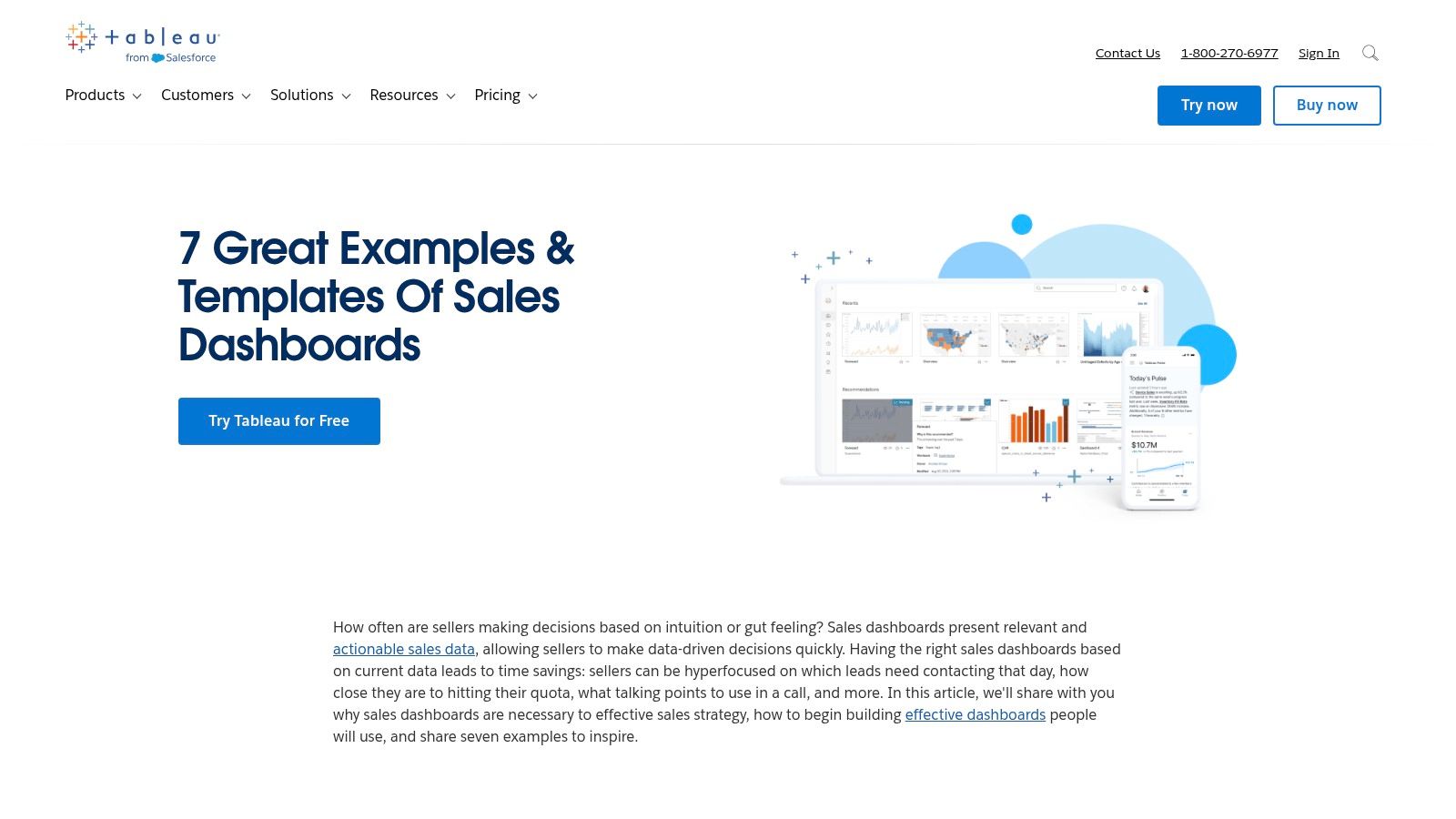
The platform's core strength is its drag-and-drop interface that empowers users to build deeply interactive and visually stunning dashboards without writing code. This makes it ideal for businesses that need to perform complex data analysis, identify hidden trends, and share collaborative insights across the entire organization, from sales reps to the C-suite.
Strategic Analysis & Actionable Takeaways
Tableau dashboards are built for deep exploration. A typical sales dashboard might feature a geographic map showing Sales by Region, a trend line for Quarter-over-Quarter Growth, and interactive filters that allow a manager to drill down into an individual rep's performance or a specific product line's success. The emphasis is on dynamic interaction rather than static reporting.
Strategic Insight: Tableau's key advantage lies in its predictive analytics and forecasting capabilities. A sales leader can use its built-in tools to create a what-if analysis, modeling how changes in lead volume or conversion rates could impact future revenue. This shifts the dashboard from a historical record to a forward-looking strategic planning tool. You can explore different sales forecasting methods to see what best fits this model.
Actionable takeaways for your own dashboard:
- Embrace Interactivity: Instead of static charts, use filters and drill-down capabilities. Allow users to click on a region, a sales rep, or a time period to see related data update in real time across the entire dashboard.
- Layer Multiple Data Sources: Combine your CRM data (deal stages, close rates) with marketing data (lead source) and financial data (profit margin per sale) to get a holistic view of what drives profitable growth.
- Use Geographic Visualizations: For teams with a regional or international focus, a map-based visualization is often more intuitive for understanding performance than a simple table or bar chart.
Platform Details
- Best For: Data-driven organizations and enterprise teams that require advanced, customizable analytics and the ability to integrate disparate data sources for complex analysis.
- Pricing: Tableau offers various subscription tiers, including "Creator," "Explorer," and "Viewer," with pricing starting at around $75 per user/month for the Creator license.
- Pros: Unmatched data visualization and analytics power, extensive integration capabilities, and strong tools for team collaboration and sharing.
- Cons: The platform has a considerable learning curve for non-analysts, and the pricing structure can become expensive for large teams.
Website:https://www.tableau.com/learn/articles/sales-dashboards-examples-and-templates
Sales Dashboard Features Comparison of Top 7 Tools
| Tool | Implementation Complexity 🔄 | Resource Requirements ⚡ | Expected Outcomes 📊 | Ideal Use Cases 💡 | Key Advantages ⭐ |
|---|---|---|---|---|---|
| Scoro | Medium – feature-rich with learning curve | Moderate – requires integration setup | Comprehensive sales management and forecasting | Businesses needing all-in-one sales management | Advanced CRM, customizable dashboards, strong integrations |
| Pipedrive | Low – intuitive and simple setup | Low – affordable pricing tiers | Effective pipeline and activity tracking | Small to medium sales teams seeking affordable tools | Visual pipeline, easy customization, user-friendly |
| Databox | Low – easy setup with templates | Low to Moderate – wide integrations | Real-time insights and multi-source data visualization | Non-technical users needing broad data integration | Pre-built templates, drag-and-drop, mobile access |
| Smartsheet | Low – minimal learning curve | Moderate – higher pricing | Flexible sales data planning with collaboration | Teams needing sales insights plus project management | Collaboration tools, flexible templates, automation |
| Geckoboard | Low – quick setup with widgets | Moderate – pricing may be high | Real-time data visibility and team motivation | Teams focused on data display and motivation | Simple dashboard creation, real-time updates, sharing |
| HubSpot | Medium – integrated ecosystem | Moderate to High – pricing varies | Unified sales, marketing, and service analytics | Businesses invested in HubSpot ecosystem | Strong data security, customizable dashboards, integrations |
| Tableau | High – steep learning curve | High – requires data expertise | Advanced analytics and forecasting insights | Complex data analysis and BI needs | Powerful visualizations, advanced analytics, collaboration |
From Insight to Impact: Building Your Ultimate Sales Dashboard
We have journeyed through a curated gallery of powerful sales dashboard examples, each offering a unique lens through which to view and manage performance. From the comprehensive project management integration of Scoro and Smartsheet to the sales-centric focus of Pipedrive and HubSpot, the variety is clear. The granular, real-time reporting of Geckoboard, the multi-source aggregation of Databox, and the deep-dive analytical power of Tableau further illustrate a critical truth: there is no universal "best" sales dashboard.
The most effective dashboard is not the one with the most charts or the flashiest design. It is the one that is meticulously tailored to answer your team's most pressing strategic questions. The examples we analyzed demonstrate that the ultimate goal is to transform raw data into actionable insights that drive decisive, revenue-generating behavior.
Your Action Plan for Building a High-Impact Dashboard
To move from inspiration to implementation, focus on a clear, strategic process. The sales dashboard examples in this article are your blueprints. Use them to guide your thinking as you define your own requirements.
Actionable Next Steps:
Define Your "Why": Before you even look at a tool, convene with your sales leaders and reps. Ask the fundamental question: "What critical decisions do we need this dashboard to inform?" Is it about daily activity management, quarterly forecasting, or identifying pipeline bottlenecks? Your answer is your North Star.
Identify Your Key Metrics: Based on your "why," list the non-negotiable KPIs. For a B2B startup, this might be New Leads Created, Sales Cycle Length, and Lead-to-Opportunity Conversion Rate. An established team might focus more on Customer Lifetime Value (CLV) and Upsell/Cross-sell Revenue.
Choose the Right Tool for the Job: Revisit the tools we covered.
- Need an all-in-one system for sales and project management? Scoro or Smartsheet are strong contenders.
- Is your priority a clean, intuitive sales pipeline visualization? Pipedrive or HubSpot excel here.
- Do you need to aggregate data from multiple sources into one view? Databox is built for this.
- Require a simple, highly visible dashboard for team-wide motivation? Geckoboard is your solution.
- Need to perform complex, custom analysis on massive datasets? Tableau is the undisputed heavyweight.
Prototype and Iterate: Your first version will not be your last. Build a prototype based on your chosen metrics and layout. Share it with your team and gather feedback. Is the information clear? Is anything missing? Is it easy to understand in under 30 seconds? Continuously refine it based on real-world use.
Remember, a great dashboard is a living document. It should evolve as your team’s goals, strategies, and market conditions change. The most valuable insight from these sales dashboard examples is that clarity and purpose trump complexity every time.
A world-class sales dashboard is only as powerful as the data feeding it. If your team is struggling to fill the top of the funnel with qualified leads, your charts will only highlight the problem, not solve it. Supercharge your pipeline with DublinRush, which provides a high-quality B2B lead vault and proven outreach frameworks specifically for the Irish market. Fuel your new dashboard with a steady stream of opportunities by visiting DublinRush today.